Palettte App
The advanced color palette editor
Palettte App is a free design tool that helps you to build, analalyze and finetune color palettes.
Import palettes via JSON or start from scratch, tweak them and export them again to JSON, css or via plain text into other design tools.
I designed and developed this tool with react and gatsby.
Why yet another color palette tool?
Most existing apps generate new color schemes based on different geometrical concepts such as complementary colors or colors that are laid out in a triangle or other shapes in a given color space.
The resulting color schemes might be suitable for logos or classic graphic design, but they rarely work for UI Design, where you usually need to work with a few base colors (often defined by brand guidelines) and a whole range of different variations and shades.
Steve Schoger does a good job of describing how to build such a color palette:
Building your color palette
Another great article on this topic is by Eric Kennedy:
Color in UI Design - a practical Framework
What Steve doesn't describe exactly is how to find those colors:"...you just need to fill in the gaps in between", "Trust your eyes, not the numbers."
This is where Palettte App comes in:
- Create smooth color schemes that flow from one color to another
- Fine-tune the hue, saturation value gradients of your palette and of each color swatch individually
- Import, analyze and edit existing color schemes, find errors or automatically find the most similar colors from a new palette to a list of legacy colors from your codebase
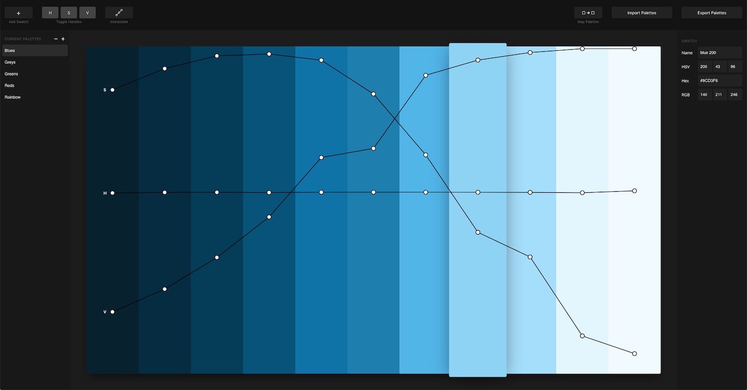
Building a new color palette
To create a new color palette, click on the plus icon in the left sidebar and delete all sample colors by hitting the backspace key. You can now add your base color by clicking "add swatch" or by hitting the space bar and entering the HEX value in the right sidebar.
As you add more swatches you can see that three curves form: one for the hue, one for the saturation and one for the value (=brightness) of the colors.
A basic palette for UI Design consists of 8-10 shades where the hue stays the same for all shades, the value goes up and the saturation goes down smoothly as the colors get lighter.
Analyzing and editing existing color palettes
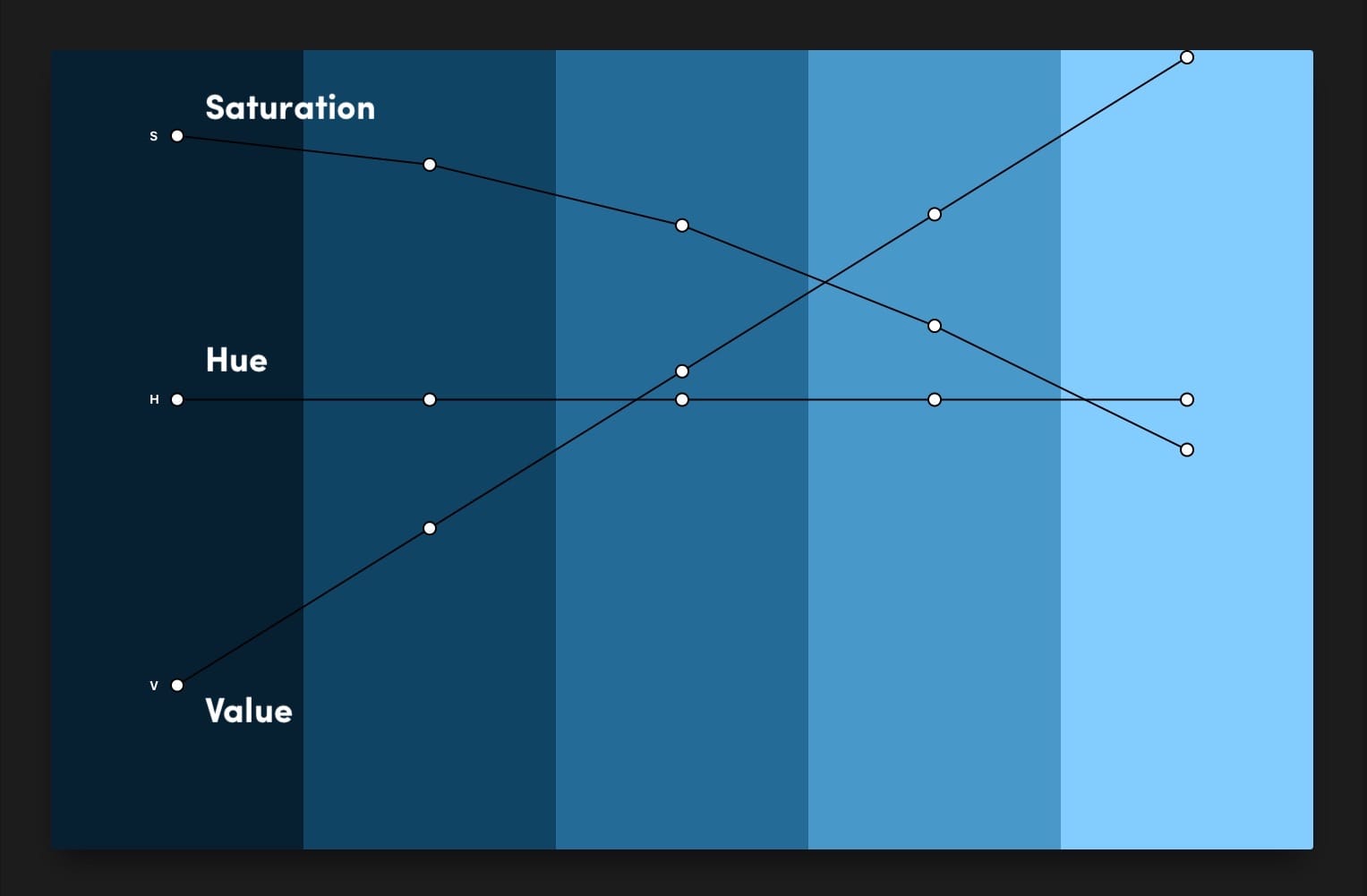
If you already have a color palette and you want to see if it can be optimized, you can import the colors one at a time or write the palette down in JSON format (example can be seen when you click on import) and batch import your palette.
Here is the palette Steve Schoger uses in his example in Refactoring UI:
As you can see there is a little dip in the value envelope curve and the saturation curve starts out round and then suddenly drops off linearly. Nothing too serious but it's clear that Steve chose his colors by "trusting his eyes" and not his numbers ;).
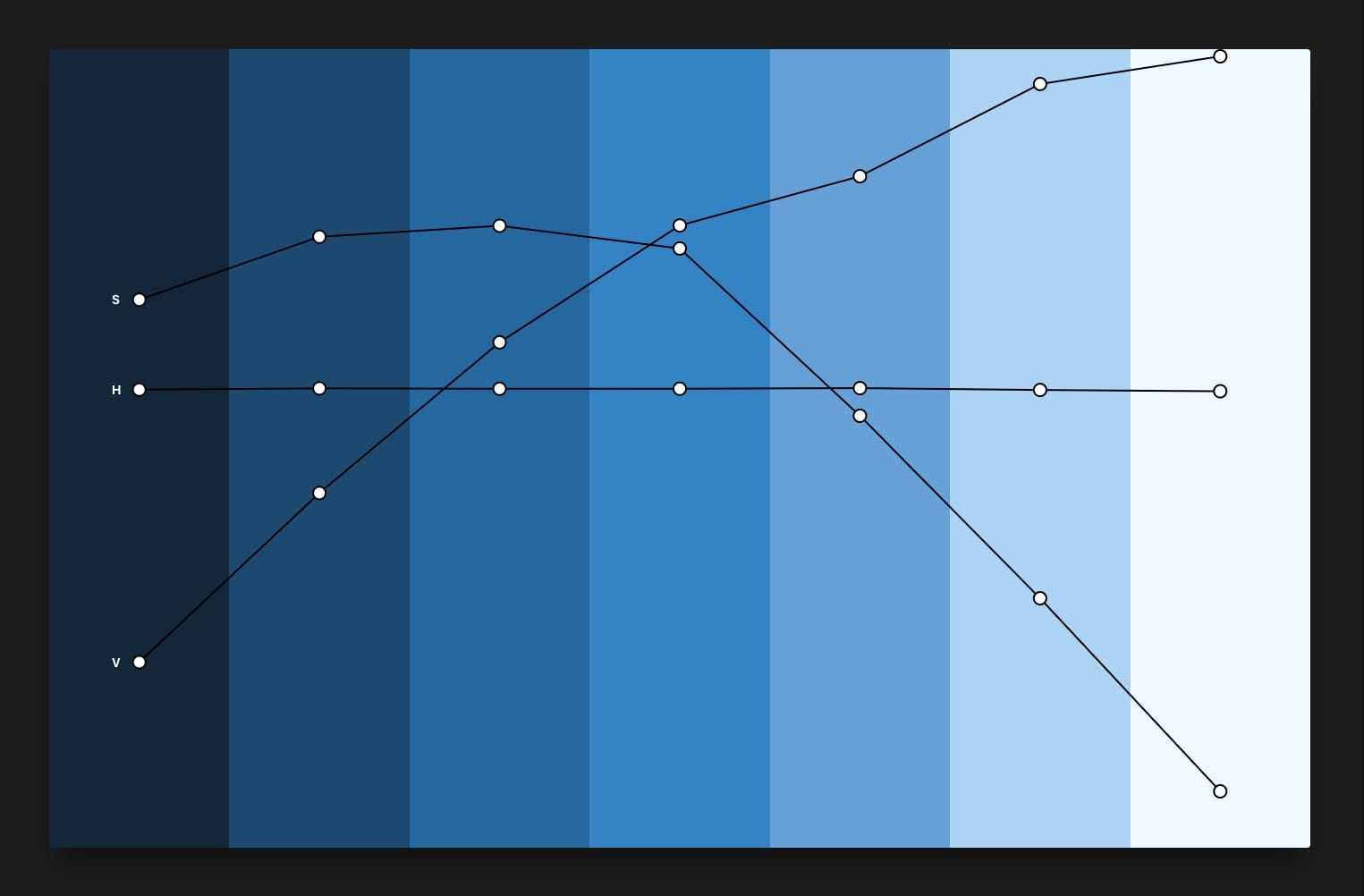
You can edit the lines by dragging the handles around or by selecting two handles and clicking on "interpolate" (only linear interpolation is supported at the moment).
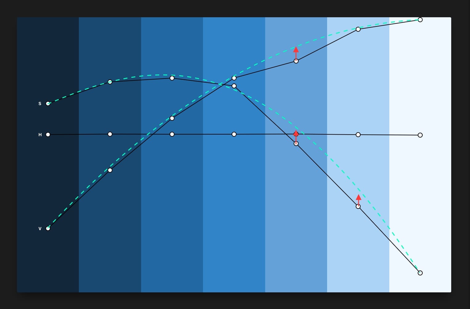
When you are happy with the result, simply export your new colors again.
Mapping old colors to new ones
Often you will find yourself in a situation where you have built a wonderful new color palette, but your legacy code does not reflect the beauty of it, because a lot of different shades and colors have accumulated over time.
With Palettte App, you can import these (legacy) colors and automatically find the most similar colors from your new palettes automatically. You will also immediatly see immediatly when colors are too far off, and you need to add more colors to your palettes.
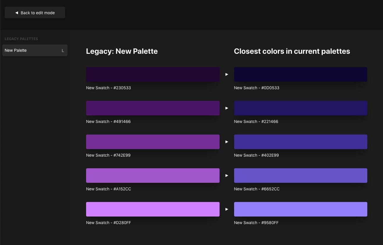
It can also be useful if you want to add shades to your palette and need to rename all existing colors.
Update: Steve Schoger and Eric Kennedy are now both using Palettte App.
Update 2: Palettte App was acquired in 2025.